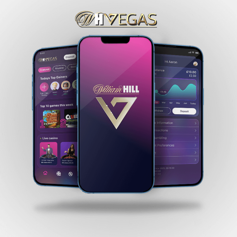
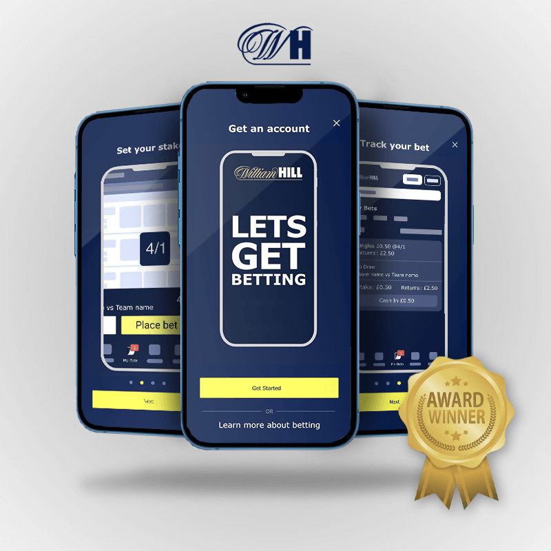
William Hill is a British gambling company headquartered in London, England. The business is split into two divisions, UK and International. They have various online products such as apps, desktop, mobile and tablet sites, and a large retail holding of stores
The current my account design where using the mobile web screens inside the app. My task was to create a native version that would work on IOS and Android devices and be understandable for those users and along the way see what improvement could be added. I had to keep in mind that William Hills style guide should be abided by and I had to make sure that the web and native apps has similar content.
I conducted a card sorting test as to try and find out what was the most efficient way to get people to filter the different categories and into different orders I conducted 2 different tests and closed card test and a open card test, which helped me get a better understand on how users interpreted what they would expect. I conducted both test with 10 users each which gave a total result of 20 users.
This work myself and another UX designer carried out help the rest of William Hill to understand the my account section as well as Menu and navigation.

The initial brief was to create a native experience for my account section without impacting the current user experience but with using the native style guides from HIG (Human interface guidelines) and material design.
I decided to test our current experience against the new list view experience to see which user preferred to navigate with. On both of these designs I made the interaction patterns native as to not make the test bias and give a fair result.


Test results after testing with 6 users on usertesting.com I found that the majority of users found it a lot easier to navigate around my account with a list view many of the users mentioned that it was what they would expect to see and the icons on the original did not seem to add any value to the user experience. Some users mentioned that it was intuitive to have a list view and easier to read the interface
I ran various different user tests which switched out various different categories to try and find the most optimal solution for user to find what they were looking for. This was the first solution which follows the card sorting test approach. Which you can see was not 100% the best solution. Which lead me to use my initiative as well as users’ feedback to restructure my account section again


After testing the designs with various different structures, we came to a final result for the most optimal structure for my account. There were some outliers such as inbox which users categorised on the card sorting test to be inside of a communications section but upon reviewing the designs users could not find it in that section so in this case I listened to the users and moved it to the main my account navigation. Also, with “change password” and “login preferences” users were evenly split what location. They went to find these although on second attempt they found their destination.
I created this user flow to give the developer teams as well as the wide design team a direction of how the my account section would be. This also shows how the my account section will change categories depending on the what app it is shown on as well as derestriction

I first kept in mind that I had to create a native version of the current tiled design in my account which I felt could use the native list views that you see on apple human interface design and on material design. I set about trying to restructure this keeping in mind the current style guide as well. I also added the native modal view that most IOS user would expect to see from IOS12 onwards. I also did the same for android giving it the same structure. I had to create this in dark mode and light mode as to comply with the apple guidelines I did this for android, tablet and iPad sizes also.
The light mode for IOS was using most of the William Hill style guide from the web styles, although I adapted them to the IOS human interface guidelines when need such as the modal view and list view


The IOS dark mode was a bit more challenging as William Hill did not have a dark mode colour pallet so I had to adapt my designs around this. Also some of the elements on the brand guidelines are dark already so this helped me come up with a dark mode.
With the android designs I used the light mode styles I created from the William hill styles guide and keeping in mind the IOS styles as well. But with the android version I used the material design guidelines to create the main structure. The reason for this was android uses these guidelines and it would fit in with users expectations


The dark mode for android was pretty simple to create after I already had the light mode and from the IOS version so it was a case of using these colours for the dark mode along with the material designs guidelines
I made my prototypes inside both Figma and Protopie at various different stages of the project. I tried to emulate exactly how a modal view would look as well as the way the native app should navigate so that users would get the full experience
All parties involved where extremely happy with the designs and approach for the native my account section and this work is now inside the live William Hill sportsbook app. The web team also liked the way I approached my design decisions and used the same data to switch to a list view for the web users which will eventually make its way into there road map